Case study
From menu to storefront.
A restaurant-ordering concept with food photography, Add to cart, and a visible order summary. Drag the handle to compare.
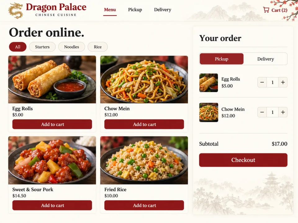 Original sample restaurant website with a text-based menu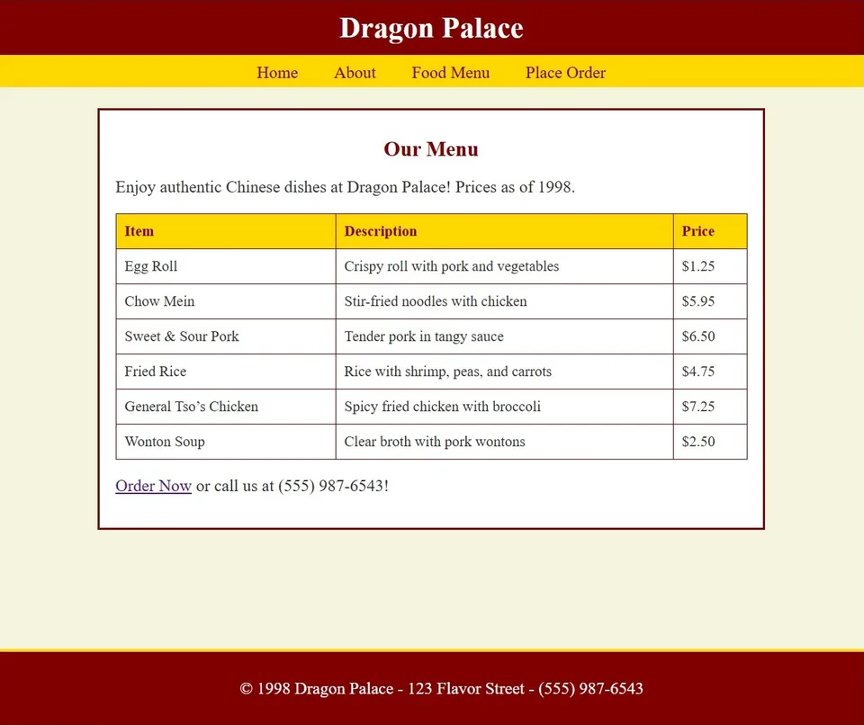
This concept shows the shift from reading a menu to building an order: food photographs, clear prices, Add to cart, quantity controls, and a visible cart. The generated after image illustrates the layout; it is not a working checkout.
What we typically improve
- Information hierarchy and scannability
- Primary/secondary CTA contrast and placement
- Layout rhythm, spacing, and typography
- Accessibility — contrast, focus, semantics
- Page weight and perceived performance